


Hands Creating Hands
April 11, 2023
Over six months, the students in James Caldwell’s AP Art Class have worked hard to create pieces for their AP portfolio. As of right now, each student has 7 pieces fully finished, putting them over halfway complete with their portfolios. Now that the students are so far along in their creative process, let’s look into each of their sustained investigations and dive into the processes, inspirations, and meanings behind each piece. The first student we will look into is me, Marisa Brown.
For my sustained investigation, I wanted to explore how I could demonstrate who I was as a person through a focus on the hands. What this means is that all of my pieces will be focused on hands. They will contain almost no facial portraits, so the viewer can only see who I am through my hands. So far, I have explored the themes of personal things that are important to me, as well as mental health, emotions, self-expression, and color in my pieces. Right now I have 7 pieces done, an 8th one started and I need between 10 and fifteen completed pieces by the end of the year. Let’s take a look at the pieces:
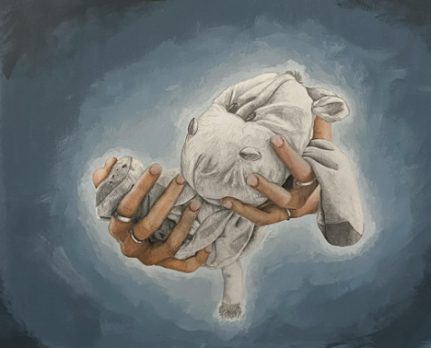
Title: Hippo
Medium: Graphite Pencil, Colored Pencils, and Acrylic Paint
Meaning: This piece falls under my theme of personal things that are important to me. The focus of this piece is on my hands as I hold an old stuffed animal named “Hippo”. Hippo is a very special stuffed animal that I have had since I was born which is why he is drawn in gray as opposed to my hands which are drawn in color. The difference in color is meant to represent the past and present. Hippo is old and I have many past memories with him. However, my hands are in color to represent that this stuffed animal is still very special to me today. I wanted it to feel like he was being held almost like a baby to create a caring feeling and to represent the importance he has to me. The background is designed to create a soft light contributing to the soft and caring feeling I wanted to portray with this piece.
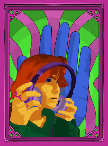
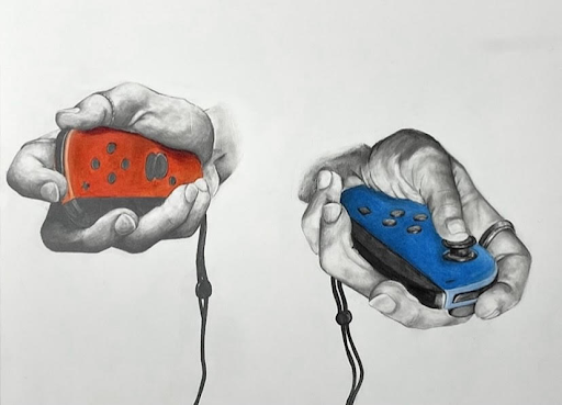
Title: *To be Determined
Medium: Digital Art piece created on Procreate
Meaning: This piece falls under my theme of personal things that are important to me and was created to represent my love of music. Music is really important to me and has been my entire life. Whether I am stressed out, happy, sad, etc. I always have music playing and it is often used as an escape. Music is also something my dad and I both have a passion for, so it brings us closer together. While creating this piece I was inspired by the music posters of the 60s. I was specifically inspired by those of Jimi Hendrix because I really liked how bright the colors were and the style in which the faces were designed. In my piece, I wanted to try and incorporate these aspects into it in order to create my own kind of music poster. The giant hand in the background is included not only to create contrast between the background and myself, but it also ties together the focus of hands in this piece.
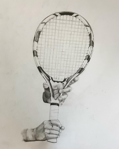
Title: *To be Determined
Medium: Graphite Pencil
Meaning: This piece falls under my theme of personal things that are important to me. Just like my piece “Hippo,” this is in black and white to represent how tennis has been an important part of my life since I was a little kid. It will forever hold a special place in my heart because of the memories attached to it. I plan to create a soft background like the one in “Hippo,” except using green as opposed to blue. Doing this will draw focus to the hands and the racquet.
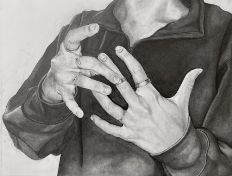
Title: The Rings
Medium: Graphite Pencil
Meaning: This piece falls under the theme of self-expression. In it, I am putting on my rings which I wear every single day. For me, wearing these rings is a form of self-expression that makes me feel more like myself and more confident. In the piece, I also pushed my values and played with foreshortening. I really wanted to create an almost hyperrealistic, picturesque piece, and so I paid extra attention to the subtle changes in shadow on the hands as well as the details in the nails.
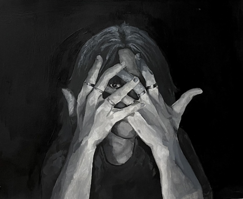
Title: Overwhelmed with Stress
Medium: Gouache Paint
Meaning: This piece falls under the theme of mental health/emotions and color. In it, I wanted to portray a feeling of stress and wanting to hide from it. This piece is a representation of my struggles with stress. I wanted it to be very dark in color, with the background being the darkest black, in order to create a feeling of being overcrowded and overwhelmed by thoughts and feelings. The position of the hands covering the face is meant to demonstrate the feeling of stress. I chose a gray monochromatic color scale because when I am experiencing these emotions, that is the color that I imagine.
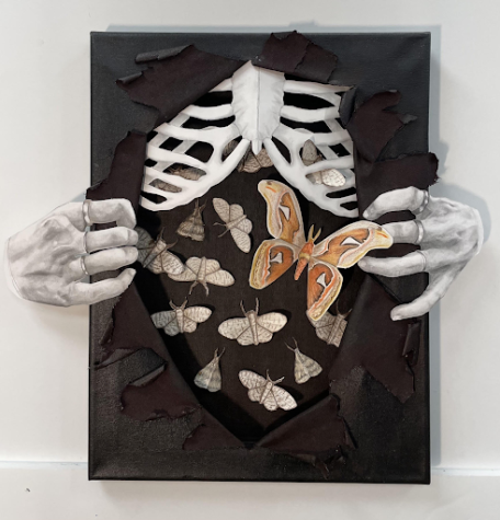
Title: Get Out
Medium: Multimedia, Graphite Pencil, Colored Pencils, Acrylic Paint
Meaning: This piece falls under the theme of mental health/emotions. It is the first multimedia piece in my portfolio and is meant to be representative of anxiety and of my personal struggles with it throughout my life. The piece is of a stomach being ripped open to release a swarm of moths. Moths are sometimes referred to as anti-butterflies and tend to have a more negative connotation. When someone is excited, they tend to have butterflies in their stomach, but when they are anxious, it feels negative and bad, which is why I chose moths to represent that anxious feeling. The action of the hands tearing open the stomach is supposed to represent the feeling of trying to escape anxiety and release it, which can be very hard and sometimes painful.
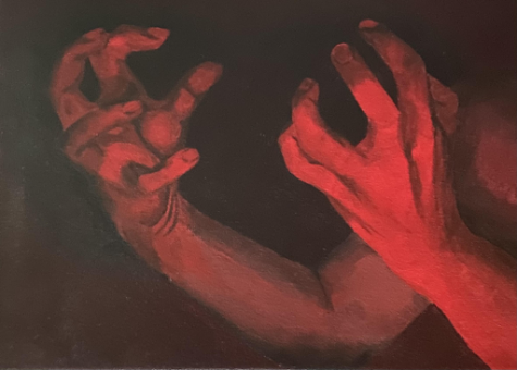
Title: Rage
Medium: Acrylic Paint
Meaning: This piece falls under the theme of mental health/emotions and color. After creating my piece “Overwhelmed with Stress,” I decided that I wanted to explore how monochromatic colors accompanied by a specific hand position can portray emotion. In this piece, I wanted to create the feeling of aggression and anger using monochromatic red and exaggerated hand positions. I used a lowkey color scheme so that the values would be much darker in order to portray that feeling of rage. I also wanted the hand position to feel very aggressive and tense.
The AP Art Portfolio is due on May 5th, so students have a little less than two months to finish up their portfolios. We can’t wait to see what they will create next. Next month we will take a look into the work of Hannah Morgan! Stay Tuned!